
Big Brands Changing Their Logo? What’s The Reason?
PEP Stores is a South African institution. Starting with one outlet in 1965, it now describes itself as the largest single-brand retailer in the country.
But why has the company decided to change its logo in 2020? What does this mean for you?
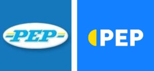
PEP Stores has had the same logo for ever since I can remember, and today they’ve ‘blended’ it up—what do you think of it?
 Bruce Whitfield, The Money Show host, gets some insight from The Money Show regular Andy Rice.
The branding and advertising expert defines the move as “a radical departure.” They’ve got no less than 2,350 stores in South Africa…the yellow-and-blue-and-white almost flag-like logo of old that everybody knows…Now the decision’s been taken to move to a certain, more contemporary logo…It still retains the colours of blue, white and yellow but slightly different weightings between the three…
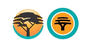
In a move to keep up with the times, First National Bank (FNB) is undertaking a significant brand redesign and overhauling its digital platforms. The bank’s famous acacia tree logo will remain firmly in place, albeit updated to imbue it with a digital look and feel more in step with the fintech world. Fintech refers to technology that automates financial services so that customers can transact using computers or smartphones.
As part of the sweeping changes, FNB, which is owned by JSE-listed FirstRand Group, is overhauling its FNB app, which was Africa’s first banking app, with a redesign aimed at offering “more intuitive help through its ease of use and a safer digital experience”.
FNB says its roots can be traced back to the Eastern Province Bank formed in Grahamstown in 1838—making it South Africa’s oldest bank.
 Kia has revealed its new logo and brand slogan in a world-record-breaking light show in Seoul that rivalled any international New Year’s celebration.
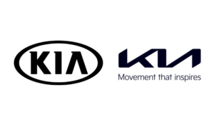
The car brand unveiled its new look, which includes a dramatically different logo design resembling a handwritten signature. The event was attended by Kia executives, celebrities, and members of the public. It was also broadcast on TV and online.
The three letters from the word ‘Kia’ have been merged together to form one simple symbol that is reminiscent of a handwritten signature. The letters are placed horizontally and are connected by lines above them.
Kia says that this new logo design “represents Kia as an integrated whole” and will be used across all aspects of its branding going forward.
 Kia introduced its new brand positioning: Movement that inspires. The concept behind it is that whatever Kia does, every consumer touchpoint and every product it creates is there to inspire you.
With the new brand positioning, a new logo that was designed by Luc Donckerwolke together with Blackspace and a unique visual language created by Innocean Berlin and Kia Design Center got introduced.
The graphic system celebrates the new logo by taking inspiration from it by using parts of the logo to turn them into graphical motifs. These motifs combined allow us to create an easy-to-use and modular system which stays recognizable throughout every format.
Along with the graphic system, Kia changed their colours to Midnight Black and Polar White as primary colours. Afternoon Yellow, Forest Green, and City Grey as secondary colours, and Kia Live Red is a spot colour.
While the primary colours are the dominant colours throughout the visual identity, the secondary colours have special use in photography. Using these different colours allows us to create a strong narrative for every image.
In the end, logos have the power to really make an impact on your brand as a whole. These aren’t just simple name additions; they’re powerful visual representations of your business and its ideals. If a logo change is something that you’re considering right now, remember to keep these things in mind when you move forward. A great logo can do wonders for your overall brand, but choosing the right one can be tricky. Hopefully, this advice will help you steer clear of the pitfalls and to choose the right logo for your business.


